Mazda 1: Build & Price Tool
Developing a more intuitive user journey and minimizing identified pain points
Overview
Mazda's comprehensive Build & Price tool empowers users to tailor their vehicle specifications to their preferences. While this journey is undoubtedly thrilling, it comes with its own set of limitations. Through meticulous user research, I pinpointed pain points and devised innovative solutions aimed at enhancing the build process, ensuring a seamless experience that enables users to create their dream car effortlessly.
Role UX/ UI Design
Challenges Developing a balance between options and ease of use
User Research, Visual Design, Prototyping
The Looping Experience
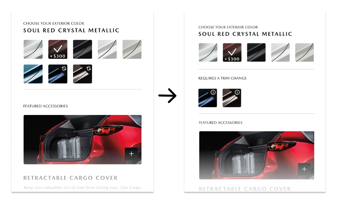
The current flow allowed users to choose selections that would not be available at their trim level, forcing the user to have to return to the start and reselect a viable option. This lead to frustration and a high bounce rate. We determined that 85% of car buyers rated color an extremely important part of the car buying process so we focused on addressing the exterior color issue first.
Solutions
One solution to deter bounce rate was to display only available colors at the trim level instead of having to build out the entire vehicle only to find that the color choice isnt viable at the end.
The Icon Issue
We also flagged the use of the ‘change’ icon that was being used and noted that participants were unclear of its’ meaning and were also missing the icon all together. My solution for this was to first, change the icon all together to give more information and also add a subsection to emphasize the user’s choice.
Mazda 2: In Transit
Tracking in-transit vehicles through the Mazda pipeline
Overview
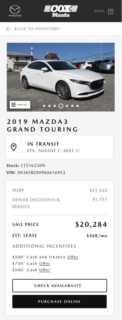
Mazda wanted to add an In-Transit feature to highlight where each vehicle is located to keep both the dealerships and customers connected to potential car purchases. This was needed for both the MazdaUSA site as well as the local dealership sites. I identified all cases where In-Transit information was needed and added them appropriately for both mobile and desktop solutions.
Role UX/ UI Design
Challenges Crafting the UI to work for both the MazdaUSA site and local dealer sites
User Research, Visual Design, Prototyping
A priority-
While the In-Transit information was a priority for the client, it made the most sense to host it in the second module with the map and dealership information, rather than the first module for the primary MazdaUSA site.
Two Views-
This visualizes the difference of how In Transit was treated on the MazdaUSA site versus the local dealership sites.
MazdaUSA Mobile
Car Detail page on the MazdaUSA site
Local Dealership Mobile
Car Detail page on local dealership


